
Michael Quach


Designing a warm and approachable digital home for Martindale Animal Hospital


Role
Product Designer
UX Researcher
Tools
Adobe XD
Sketch
Hotjar
Skills
Design thinking
Timelime
Feb 2022 (48 hours)
Accessibility (WCAG)
User flow creation
Adobe Photoshop

The McMaster Design League's 2nd Annual Designathon was a 48-hour international UX/UI competition featuring over 40 teams from five countries. Bringing together students and professionals from disciplines such as engineering, business, and the arts, the event challenged participants to solve real-world design problems with support from sponsors including Meta, Deloitte, and CIBC.

Second year me when they said we had 48 hours

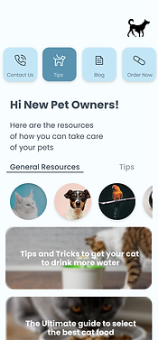
Design a mobile-first website for Martindale Animal Hospital by identifying client goals and user needs, then translating those insights into a modern, intuitive experience with a distinct brand identity.

At the start of the project, we structured our design process around two key pillars: user needs and business goals. To better understand the organization's objectives, we scheduled a consultation with one of the judges, whose insights helped clarify key business priorities and informed our design decisions throughout the project.


Now that we understood the needs of both user and stakeholder we carefully thought out the features to be included in the mobile website.

1. Establish a warm, welcoming brand identity and maintain visual consistency across the entire website
2. Incorporate authentic photography of both staff and animals throughout key sections to build trust and emotional connection
3. Design a clear, intuitive interface with strategically placed features


After the wireframing stage, we presented our work to a design mentor and professional UX designer, who provided valuable feedback. From this review session, the team identified the following key insights:
The page structure lacked clarity, so we should clearly define and separate key sections such as Home, About Us, Contact Us, Tips, Blog Posts, and the Vet Store page.


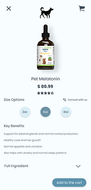
User control and freedom needed improvement—for example, adding a search bar on the Vet Store main page to allow users to easily find specific products.
CTA buttons were missing across multiple pages; we should introduce clear, purpose-driven CTAs tailored to each section, such as a prominent “Contact Us” button on the Contact page






My team and I were able to secure 1st Place at the McMaster Designathon 🥳


Working within a 48-hour deadline forced me to make quick, intentional decisions, prioritize effectively, and stay focused on solving real user problems without getting lost in perfectionism. It also reaffirmed my love for product design, working without sleep but still with a determination driven by the fun I was having. Despite the time pressure, I genuinely enjoyed the process and was (still am) super proud that my team and I took home the gold!

